
Own-brand project / Identity presentation & social direction
The brief
Give the next chapter a distinct identity while retaining a connection to JTech Media’s digital roots. The company needed to sit comfortably alongside the wider Jacee brands and lead with real estate and creative media.
The direction
Jade, deep teal, charcoal and black distinguish Jacee Media from the gold palette of the property brands. The approved Jacee wordmark remains, with colour and presentation doing the work of differentiation.
The social introduction
Three carousel directions introduce the rebrand, the creative perspective and a visual storytelling study. The voice is company-led, with the technical background supporting the creative message.
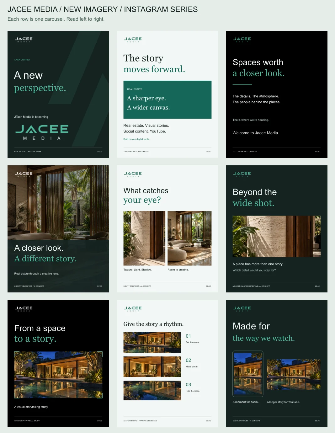
The architectural visuals in the social studies are AI-generated concepts. This project documents our own brand materials, rather than client work.